Documentation Search:
You have a fair degree of control from within Athenaeum over the appearance of the Athenaeum search web site.
You can control components such as:
-
the width of the site: fixed or full browser width
-
the number of columns on the home page and search results page
-
a banner that is displayed across the top, along with its positioning and size
-
text that is drawn over the banner
-
the background colour of the navigation bar
-
the colour of the text in the navigation bar
-
an optional "big message" to display between the header and the blog entries on the home page
-
the background colours of the home page and search results links
-
the border colour of the home page and search results links
-
the colours of the links (anchors)
-
"styling" of almost all elements on the page via a free-form css definition
Four examples of just a few different settings with (mostly) the same content are shown here. The differences are in the banner image/colour, the colour of the navigation bar, the text colour and the background colours of each entry.

differences in the data are because of the carousel(s) on the web pages, which change every 10 seconds
Notes
Athenaeum is provided with default configurations, so you don't have to do any styling. If you have a support agreement with Athenaeum Library Software, then we can provide you some direction in customising your look and feel.
Colours are generally specified in hexadecimal, e.g. #000000 is black, #FFFFFF is white and #0000FF is blue. Each pair of hexadecimal numbers is, in turn, the amount of Red, Green and Blue.
While this sounds unintuitive, there are lots of web sites that will allow you to choose from co-ordinated palettes of colours that make specifying colours much easier.
For example, this Google page shows various hues in hexadecimal: https://material.io/guidelines/style/color.html#color-color-palette. This page is an example of users contributing thousands of colour themes https://coolors.co/browser/latest/1.
You can also use RGB(X,Y,Z) format for colours.
Open Styles page
To customise your blog look and feel, click the {…}Styles button at the top of the blog page:

You can also simply click the Blog Styles tab in admin.
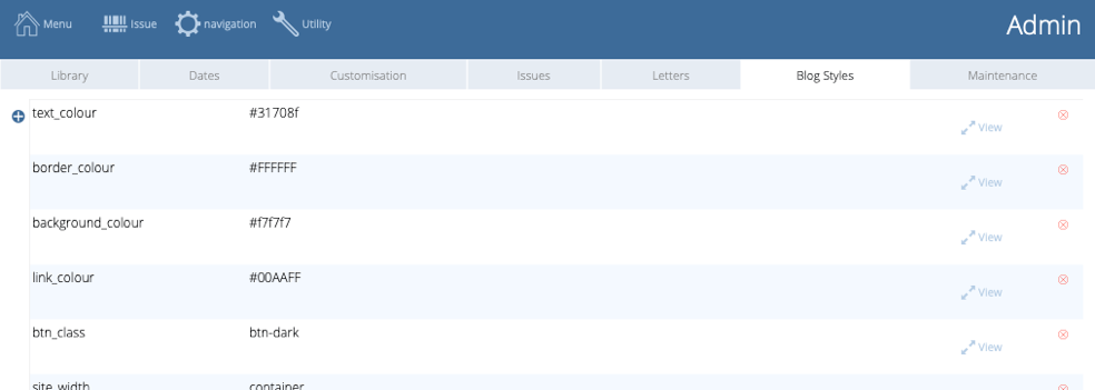
Available settings
We provide you with starter settings. However, if you have a geek handy, you can supply her/him with this list.
the name of each style option must appear exactly as shown here
| name | description | options |
|---|---|---|
| site_width | the width of the web page in the web browser window | container (fixed width) or container-fluid (full window width) |
| column_count | number of columns for blog and search results - entries start at the top left, go down first column, then top second column, etc. | any number, typically you will use 2, 3 or 4 |
| banner | style information (css) describing the content of the banner - use valid css to describe the properties e.g. background-position: center; height: 150px; background-image: url(https://librarysoftware.co.nz/f/gannet_rob-1170-150.jpg); background-size: cover; background-repeat: no-repeat; | css |
| banner_text | heading 1 text shown in front of the banner graphic - the appearance of this can be controlled in your style elemens | style sheet |
| text_colour | the colour of text on the body of each web page | hexadecimal number e.g. #31708f or #000 |
| border_colour | the colour of the border around each blog entry and search result | hex number |
| background colour | colour of the background of the web page | hex number |
| nav_background_colour | the colour of the background behind the navigation links | hex number |
| navbar_colour | colour of text in the navigation bar (should contrast with nav_background_colour) | navbar-light or navbar-dark are typical options |
| link_colour | colour of clickable hypertext links | hex number |
| btn_class | name of the Bootstrap button style | btn-light, btn-dark are the most obvious choices, though you may also use btn-primary, btn-secondary, btn-success, btn-danger, btn-warning, btn-info |
| style | raw css allowing you to customise the look, size and positioning of virtually any component on the web page (including the "big_message") - typically you would have your web designer assist you with this | css |
| big_message | message text that is inserted between the navigation bar and the blog columns on the web site home page - use this for occasional announcements such as "library closed" or "book fair" (and you can style this with CSS using the .big_message h1 {} selector | text |
| big_footer | message text inserted between the bottom of the blog columns on the home page and the copyright footer - the appearance of this can be controlled in your style elemens | style sheet |
| [Styling options] |
Your styling choices might depend upon the type of devices your patrons typically use. For example, you might be tempted to set the number of columns to 5 to suit the big screens you might have in the library, however if your library patrons are using low cost mobile devices, then these might dictate fewer columns for legibility.
Favourite snippets
The appearance of the web pages can be changed significantly with a few changes to the above elements.
And you can use those changes to better engage your library patrons. To facilitate this, you can store alternate values for the available settings in the "my styles" table. Access this by clicking the heart icon on the left of the styles table.
![]()
This takes you to the my styles page where you can store various snippets. For example, you might keep three separate banners stored here and swap them in for various occasions.
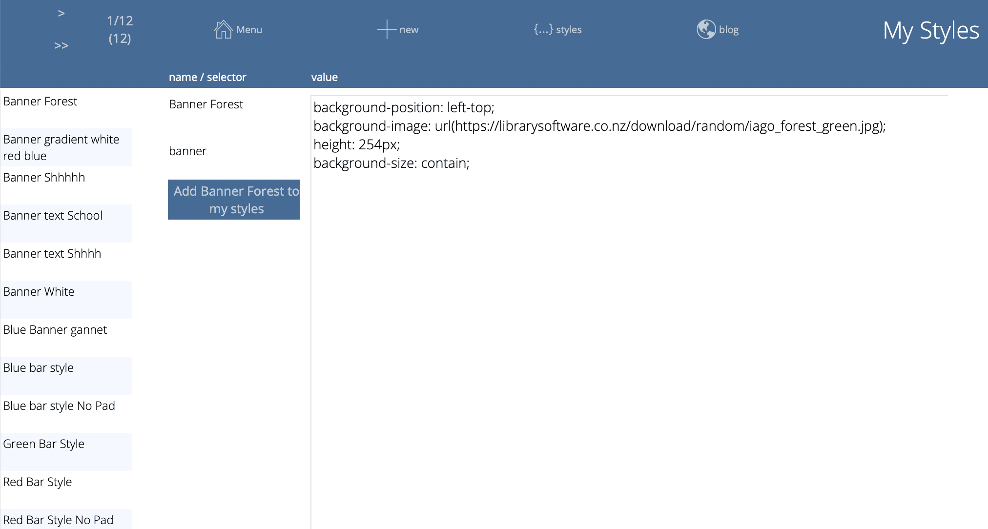
On the left is a scrolling list of all of the styles available. Note that you have to have FileMaker Pro 17 installed to use this. FileMaker Pro 16 will not show it.
Each saved style has:
-
a name that you define - e.g. Blue Banner or Green Banner, etc.
-
a "selector" type potentially defining the style component that will be swapped out
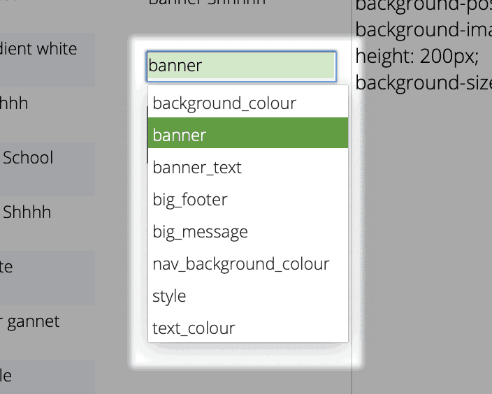
- the code or text that is saved and can be swapped in to your blog Styles
The Add "xxxx" to blog styles button will copy the content of your currently selected style, then find the matching component on the blog styles page and replace it.
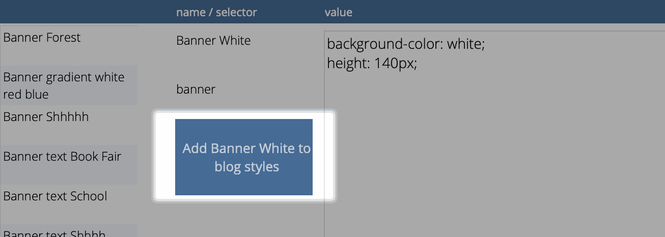
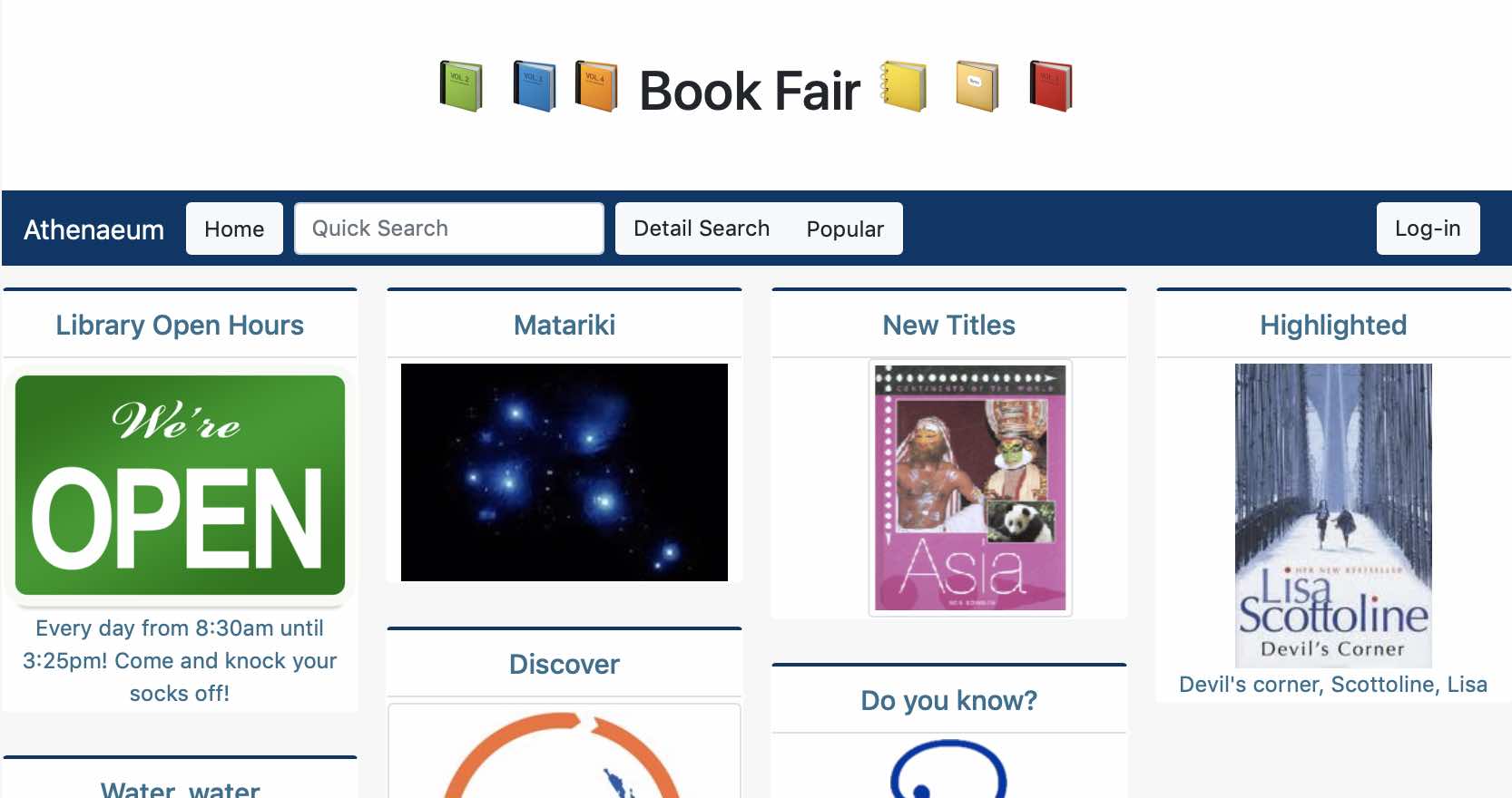
An example usage might be that you have a standard home page with the school banner across the top. However, for the week of your library book fair, you might wish to swap in a suitable banner.
In this example, instead of a school banner, pictured is the Athenaeum Takapu (gannet):
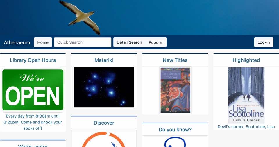
To swap this out temporarily, one can - in a few clicks - set the banner background to white and add the words "Book Fair" (with some emoji). When the page is reloaded, it is immediately updated:
-
"blog" is a term that appeared in 1999 and is a contraction of "web log" (that is, I'm posting my daily log to the web) and refers to a website that contains online personal reflections, comments, and often hyperlinks, videos, and photographs provided by the writer to their audience. ↩↩↩↩↩↩↩↩↩↩↩↩↩↩↩↩↩↩↩↩↩↩↩↩↩↩↩↩↩↩↩↩↩↩↩↩↩↩↩↩↩↩↩↩↩↩↩↩↩↩↩↩↩↩↩↩↩↩↩↩↩↩↩↩↩↩
-
the popular link that used to be in the navbar is now deprecated and replaced by the optional custom lists menu. If necessary, it can be re-instated with a "navbar=" or a custom "widget=" blog post. ↩↩↩↩↩↩↩↩↩↩↩↩↩↩
-
you may use the built-in letters, or customise those letters, or define your own letters ↩↩↩↩↩↩↩↩↩↩↩↩↩↩↩
-
you can configure this key to show the list of titles or the list of copies in admin ↩↩↩↩↩↩
-
you can configure this key to show borrower types instead in admin, if you wish ↩↩↩↩↩↩
-
the formulae are stored in Admin->Customisation->Calculations ↩↩↩↩↩↩
-
The borrower privilege does not define the item as “fiction”, “non-fiction”, etc. Rather it makes the statement: “when issuing this item, Athenaeum will count it as the specified type and compare it to the number of that type that the borrower is allowed” ↩
-
Just for fun, you can embed the web search on the desktop client search screen! ↩